
Going Underground Records
Or view the video of the final prototype
found at the bottom of this case study
Platform Desktop
Deliverables Research, Wireframes, & Prototype
Tools Sketch, InVision, Photoshop, Illustrator, & Google Drive
Role UX Researcher, UX/UI Designer
Team Niki Sylvia
Duration 2-Week Sprint
CLIENT OVERVIEW
Going Underground Records is central California’s largest and longest running vinyl store. They buy, sell, and trade records, and are known for their eclectic and rare collection.
THE PROBLEM
Going Underground Records’ e-commerce website has a convoluted faceted navigation process, information architecture that is difficult to follow, and the imagery and user interface does not match the vibe of the products and physical store.
THE GOAL
Redesign the website to improve navigation and browsing capabilities to provide a straightforward checkout process.
the process

research
& discovery
•Heuristic Evaluation
•C&C Analysis
•User Interview
•Task Analysis
•Affinity Map
ANALYZING & COMPARING
I began the research with a heuristic evaluation on the current website noting 21 violations and their severity. The critical ones being in areas of error management, learnability, and efficiency.
I then performed a competitive & comparative analysis, comparing features of competitor websites with Going Underground Records in order to display specifically where it was lacking. Here is a breakdown of the competitors:
The biggest points of concern that I learned from the C&C was that Going Underground Records would not allow the user to filter by multiple categories at the same time, nor did it display carousels of popular categories.

USER PERSPECTIVE & PAIN POINTS
In order to gain perspective on who the targeted user was, I conducted 3 user interviews with avid record collectors, who buy both online and in-store. All concluded that the biggest points of interest when buying records are:
New vs. used
Condition of the record itself
Condition of the art
Year of release
Label that released it
Track listing
“Recommended listening based on your search”
After user interviews I conducted a task analysis on 3 users, asking them to “Go through the website and shop in both list and grid mode, for 3 different albums, purchasing multiples of each one.” The following are direct user quotes:
EMERGING THEMES
I synthesized the data from the interviews and task analysis through an affinity map, where the following themes emerged:
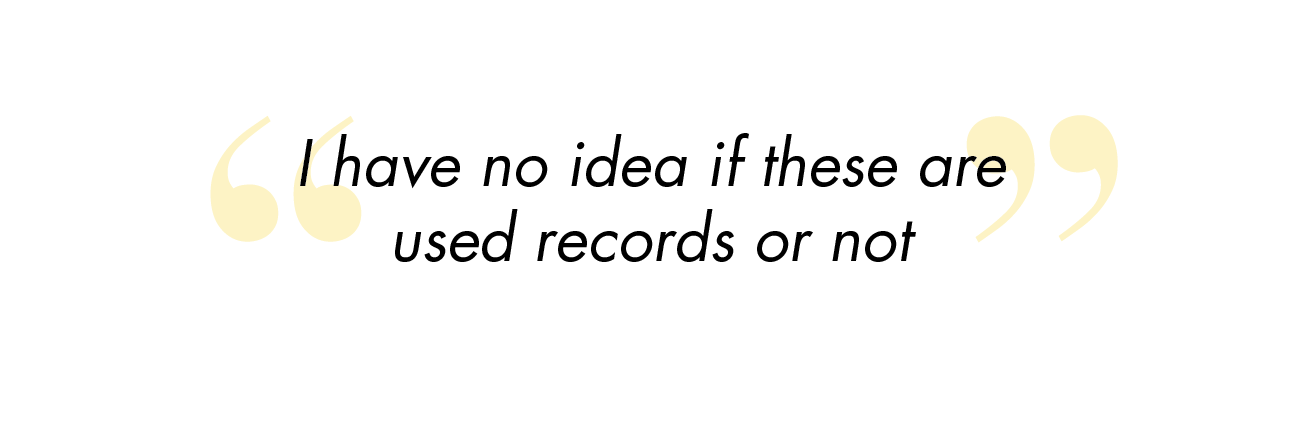
Users were confused whether they were buying new or used records [the front page of the website defines that the store sells used records, but nowhere mentions if each item is new or used)
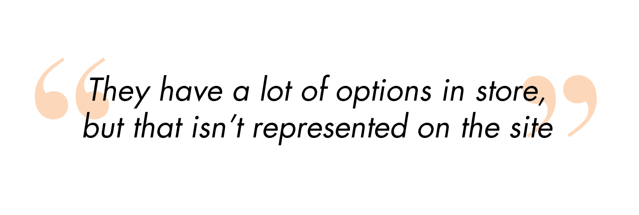
Users want multiple photos of the front and back of the album art and photos of the record itself
Users prefer for the website to list album information: track listing, label, and year of release, otherwise, they will look it up elsewhere and may purchase from a different website
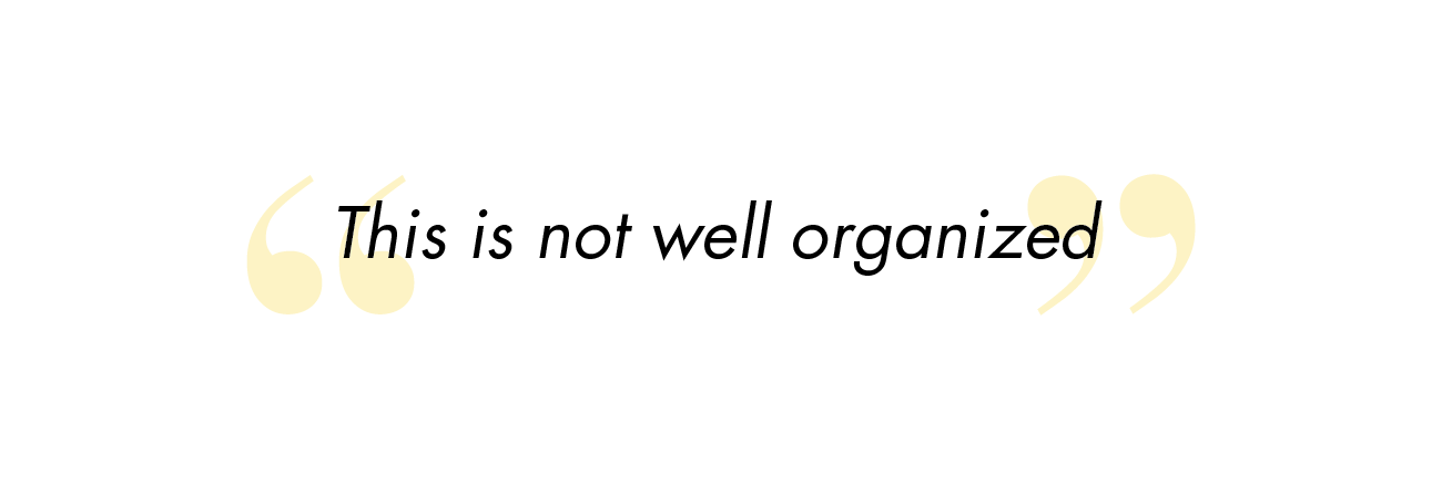
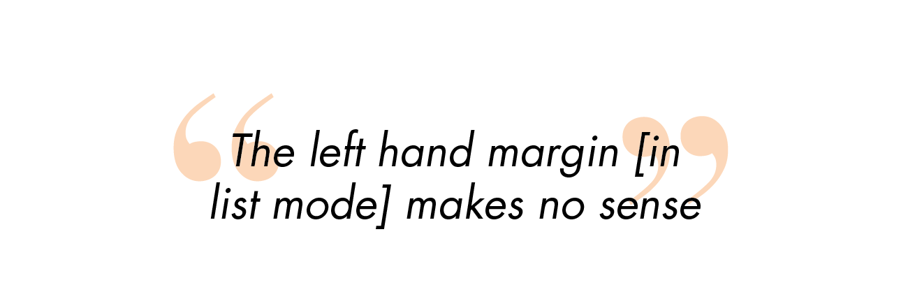
The navigation in “list” mode was completely jumbled and unusable, mixing artists, labels, years, and merchandise in one long list
defining
our research
•Persona
•Journey Map
•Feature Prioritization
•New Competitive & Comparative Analysis
•Card Sorts
•Site Map
•User Flow
SYNTHESIZING THE JOURNEY
I combined all of my research thus far into a persona, Dakota. Dakota wants an efficient way to browse online for her favorite records while getting all the supplementary information she needs to feel solid about her purchase.
I tracked Dakota’s journey through the current website with a journey map. This map illustrates her main frustrations with the lack of advanced browsing capabilities, confusing navigation, and the inability to purchase more than one album.
DISCOVERING INSIGHTS
In addition to the emotional journey map through the site, I created a user flow of the checkout process steps. By doing this I was able to uncover that the major frustrations felt by users was not due to the flow of the checkout process. The frustrating features for users was the navigation and browsing.
Click to enlarge
PINNING DOWN THE FOCAL POINT
Because of this discovery, I focused on filtering, browsing and navigation capabilities within the shopping portion of the website. I conducted another Competitive and Comparative Analysis this time not just on features, but instead on what filtering options competitors used. I also compared what different collection carousels were listed on the competitors homepages which users said would help narrow down their searches.

I took all the different possibilities based on this C&C and conducted card sorts with 5 users to further understand how users categorize information. The trends from the cards sorts were:
• Newsletter shouldn’t be in the global navigation
• Featured, New Releases, and Best Sellers are the most popular collection categories
• Genre and format are the top browsing categories
• Alphabetical, price, release date, best selling, and featured and the most popular sort by options


PRIORITIES OF THE REDESIGN
At this point, I am able to map out the priority features for the redesigned website:

ideate
& design
•Sketching
•Paper Prototype
•Medium-Fidelity Wireframes
•Mood board
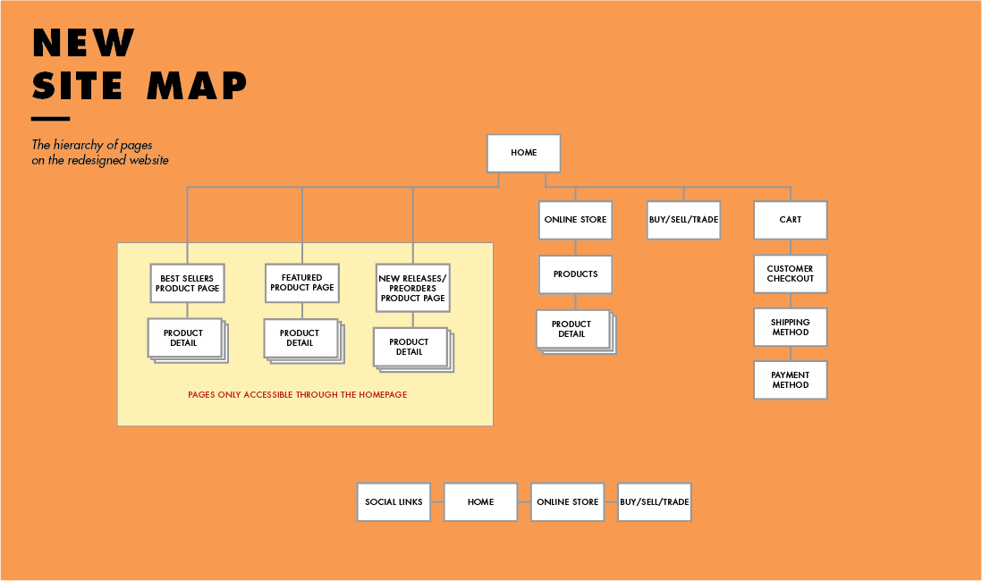
INFORMATION ARCHITECTURE
Now that I had broken down how to reorganized the information architecture based off of user research, I designed a site map based on my findings (as well as the old site map for comparison). The goal was to remove pages that didn’t hold information (location, newsletter, and contact) and incorporate that information either on the homepage or the footer.

SKETCHES
Now that I designed the updated site map, I began the redesign process by sketching out a paper prototype to visualize how the new site map would affect the user flow. I tested this paper prototype to ensure that a user could intuitively find all of the information needed, as well as easily filter and find their desired record.


MEDIUM FIDELITY PROTOTYPE
I moved from sketches to a medium-fidelity prototype, the biggest change being moving merchandise out of the faceted navigation with the vinyl, and instead in its own section which can be located through a drop-down menu on the homepage.
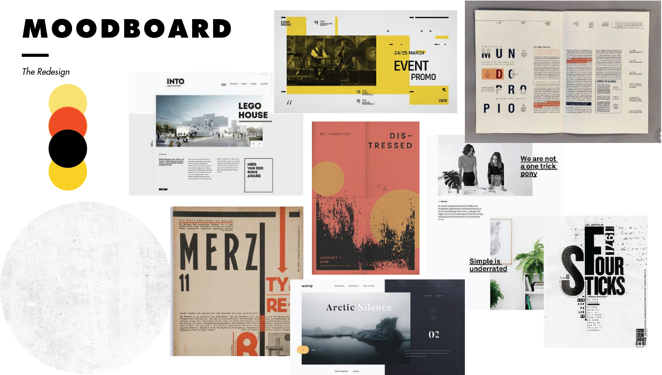
DEFINING THE MOOD
Before moving on to high-fidelity wireframes, a mood board was designed. Users said during interviews that the lack of visual professionalism of the website affected the users’ desire and trust of the company, so a branding redesign was necessary.
testing &
iteration
•Usability Testing
•High Fidelity Prototype
•Final Deliverable
TESTING THE PROTOTYPE
As I continued designing a high fidelity prototype, I also organized usability testing. I asked 3 users to go through the website and buy a punk + LP record that was $10 or under. Based on user feedback I made small design adjustments to the interface.
This resulted in the design of a medium to high-fidelity prototype that eliminated confusion and points of friction and allowed users to complete the application process.