California DMV
Or view the video of the final prototype
found at the bottom of this case study
Platform iOS
Deliverables Research, Wireframes, & Prototype
Tools Sketch, InVision, Google Drive, Illustrator
Role UX Researcher, UX/UI Designer
Team Niki Sylvia, Warren Burstein, Karma Velasquez
Duration 2-Week Sprint
CLIENT OVERVIEW
The California Department of Motor Vehicles services 40 million California residents and 27,000,000 licensed drivers as of 2017. The DMV’s mission statement is to be a recognized leader in public service, yet with a confusing app with limited functionality, they are failing to live up to this standard.
THE CHALLENGE
My team and I were tasked with re-evaluating the current mobile app and pitch an innovative and forward thinking redesign focusing on its most popular features.
THE GOAL
Our team’s goal was to redesign and streamline the most popular feature of the app.
the process
research &
discovery
•Heuristic Evaluation
•C&C Analysis
•User Interview
•Usability Testing
•Task Analysis
ESTABLISHING A HYPOTHESIS
Given our past experiences with the DMV, experience on their website, and observing the current app’s limited functionality, we assumed that scheduling an appointment would be our main focus. We began our research of the entire app, attempting to validate or invalidate this assumption.
GAINING INSIGHTS
We began our research by conducting a Heuristic Evaluation of the current DMV app in order to pinpoint issues. The app has limited features and functions, but there were two glaring issues that violated a number of heuristics:
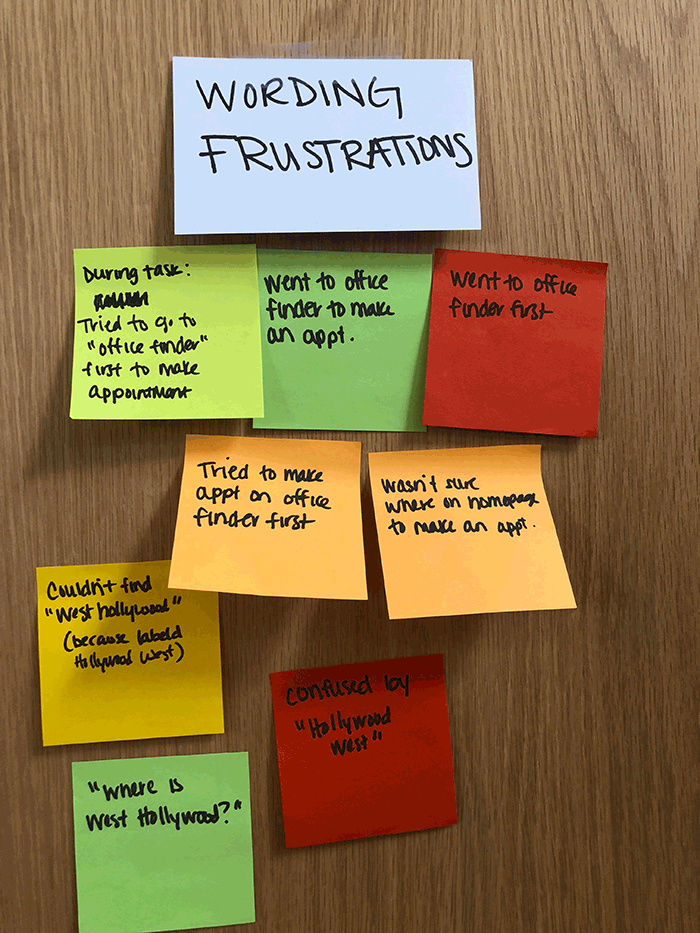
When attempting to make an appointment, choosing an office location before the desired service(s) would often lead to the app displaying locations that wouldn’t perform the service necessary, causing wasted time and frustration.
The app will display unavailable dates and times as available, which the user won’t realize until they have clicked through multiple pages to check availability. This causes the user to click the back button multiple times and re-do this flow every time to check for availability.
My team and I performed a Competitive and Comparative Analysis of other states’ apps to see how California’s app performs in comparison to other states’ and what features are common and useful. Here we observed that adding the ability to create an account and add a GPS location finder would be useful additions to fixing the appointment flow.
INTERVIEWING USERS
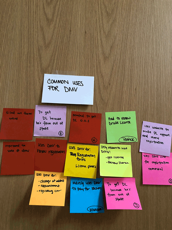
Finally, we conducted user research to understand our audience and advise our design. We spoke to California drivers who had been to the DMV recently or frequently and learned most people use the DMV website for scheduling appointments.
In conjunction with our user interviews, we performed a task analysis with our users in an attempt to validate our assessment of the aforementioned issues with the appointment scheduling flow. Our task was as follows:
You live near Hollywood and need to schedule an appointment with the DMV for a (1) driver’s license renewal and (2) vehicle registration.
REVISITING OUR ASSUMPTIONS
Our original assumption was validated based on our heuristic evaluation and task analysis as users experience frustration with:
Finding a location that processes both services
Selecting an available date and time.
IllUSTRATING CURRENT FLOW
We designed a user flow of the current app so the points of frustration are visually apparent. We noted where users experience friction with the current system (the location-service loop users would get stuck in, shown in red), leading to wasted time and some users even abandoning the app altogether.
defining
our research
•Affinity Map
•Persona
•Journey Map
•Feature Prioritization
SYNTHESIS
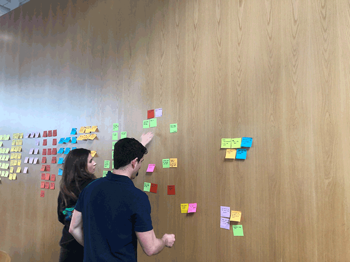
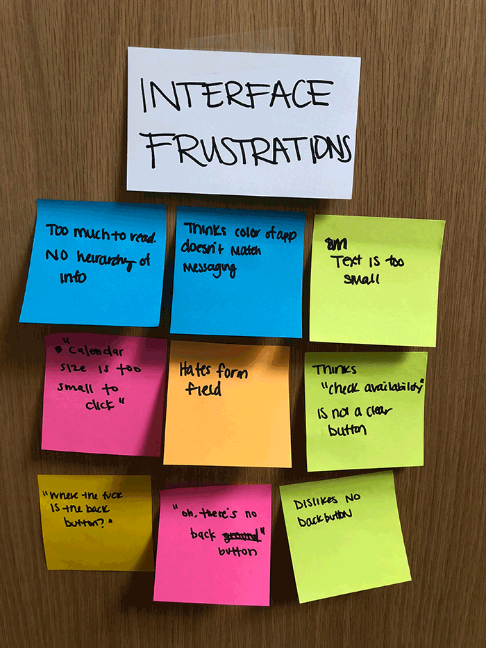
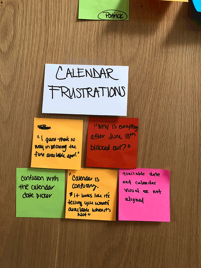
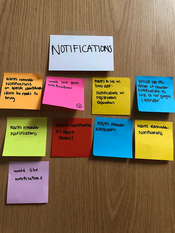
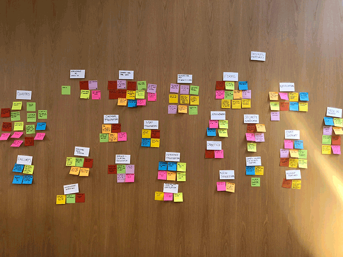
In order to synthesize and understand our research, we created an affinity map. We then grouped similar items to reveal insights and themes. Main takeaways included:
Users couldn’t find where to make an appointment
Users often didn’t know what items were going to be necessary to bring to their DMV appointment and wanted some sort of reminder
Users reacted negatively to choosing a location and then discovering numerous steps later that the service isn’t offered there
COMPILING DATA
After compiling all of our user research, we embodied that into a Persona to create a profile of our audience.
We then documented our persona’s emotional journey through the appointment flow with a journey map. This is based on our user’s journey’s during the task analysis, and averaging the points of frustration they experienced.
Scenario
Carson will be buying a used car from a friend and will need to transfer the title and register it with the DMV. Because of the new law requiring California residents to get a REAL ID by October 2020, he decides he’s going to handle the title transfer, registration, and ID at the same time. However, Carson is a busy accountant and won’t visit a DMV office without an appointment.
Problem Statement
Carson is trying to schedule an appointment but feels confused about selecting the right office location and finding an available date and time, causing him to grow frustrated and impatient.
How might we provide Carson with an intuitive and efficient way to schedule an appointment?
PRIORITIZING OUR FINDINGS
With a better understanding of our users, my team and I prioritized the features of the new app. Because of the limited duration of our project, we had to hone in on specific features for a Minimum Viable Product (MVP). The blue dots on the graph below indicate those specified features:
Click to Englarge
ideate
& design
•New User Flow
•Sketching
•Design Studio
•Wireframes
•Usability Testing
•Low to Medium Fidelity Prototype
REDESIGNING THE FLOW
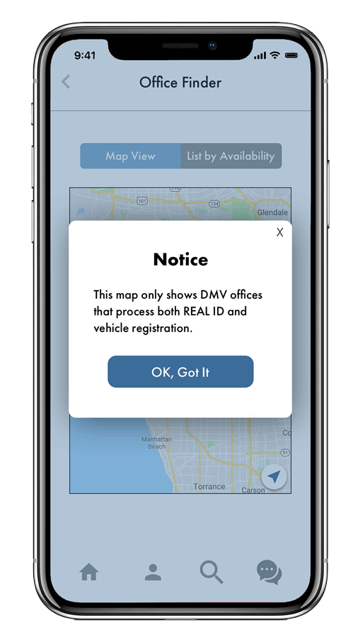
After deliberation, we decided that the most crucial point of frustration to tackle first was reworking the location-service loop that users got trapped in during their appointment scheduling flow. To resolve this, we designed for the user to select their service first, which would update the possible locations displayed, therefore only showing accurate results.
User flow of the redesigned website - click to enlarge
SKETCHING & WIREFRAMES
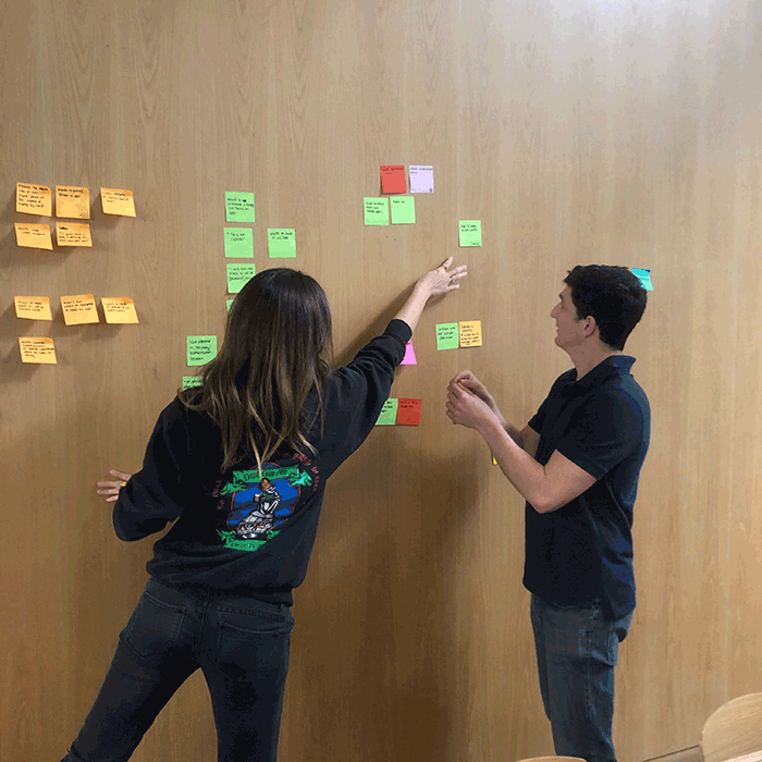
We began ideating our designs with a collaborative design studio (click images to enlarge).
We moved onto medium and high-fidelity wireframes rather quickly, focusing our design on our determined feature prioritization. Main redesign points we focused on were:
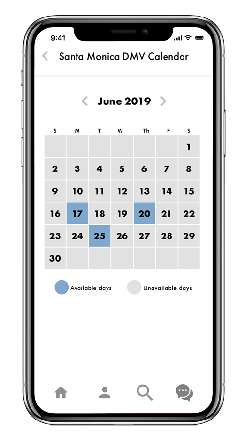
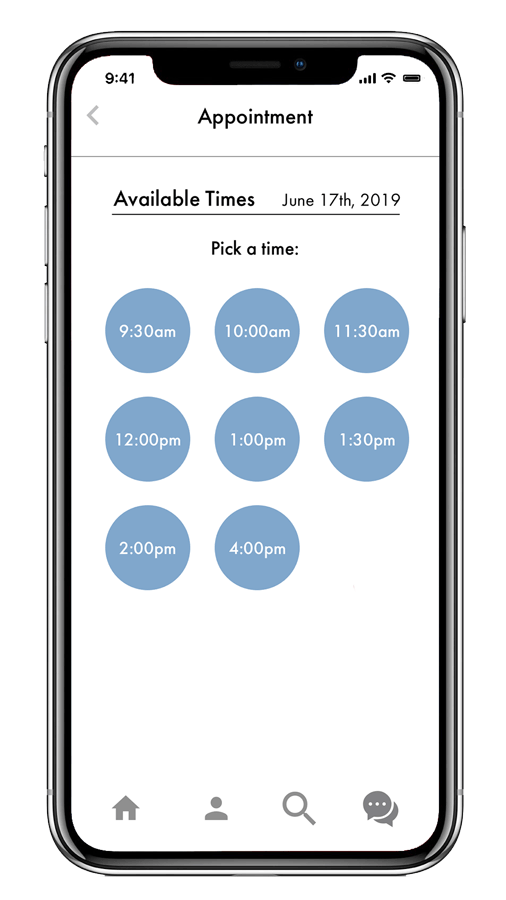
Calendar to only show available dates and times.
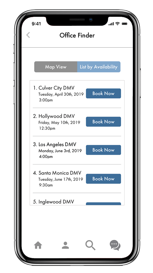
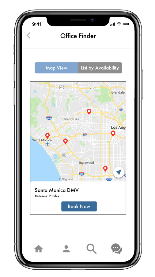
Visual map and a list view of locations (to assist users and ensure that they can find the closest office to them based on their service needed)
Here are high-fidelity wireframes of the location and calendar portion of the app:
testing &
iteration
•Usability Testing
•High Fidelity Prototype
•Next Steps & Recommendations
TESTING OUR PROTOTYPE
We conducted seven usability tests to observe how users reacted to our current prototype. During this process we made huge discoveries that led us to have to redesign a large feature of the app.
Here is a portion of the old design, where we had the user create an account at in the beginning of their appointment making flow.
Originally, we included account creation screens at the beginning of the appointment scheduling flow so users could benefit from saved information within their account. This feature allows users to fill out their forms digitally before their appointment and submit the forms electronically before they arrive at the DMV, thus saving time for the user during their in-person experience.
IMPORTANT DISCOVERIES
We discovered through usability testing that users did not like being interrupted in their appointment scheduling flow with an account creation, so we had to rethink and redesign where we placed the account creation information. To account for this problem, we created tutorial screens instead, which render upon opening the app and explain the value of creating an account.
Here is the new design based off of usability testing, where we removed account creation from the flow, but instead created tutorial screens which explain the benefits of account creation so the user can do it on their own time.
FINAL PRODUCT
Here is a video of the final flow through the app.
NEXT STEPS
A common theme was discovered during our research: users would prefer to avoid dealing with the DMV altogether. To address this, we considered ways to replace physical DMV interactions to the app, so users wouldn’t have to go to the DMV as frequently and could manage everything through their account in the app. However, because of the limited duration and scope of our project, we had to focus on the MVP. In the future, we will revisit our research and design to include the following features and service design improvements:
Features
Account Dashboard - where users can manage their profiles, personal information, forms, etc.
Fingerprint Scans and Face ID (“Security Authentication Features”) - enabling the ability to process certain DMV aspects through the app instead of in-person
Service Design
Live Chat/Chat Bot - users can have basic questions answered or assistance finding forms
Check-in screen from a mobile device upon arrival at the DMV.
