mockup--cleared-renter copy.png

Cleared Renter


Or view the video of final prototype found at the bottom of this case study


Platform Desktop
Deliverables Research, Wireframes, & Prototype
Tools Sketch, InVision, & Google Drive
Role UX Researcher, UX/UI Designer
Team Niki Sylvia, Eric Sarmiento, Adrian Arriola
Duration 3-Week Sprint

client overview

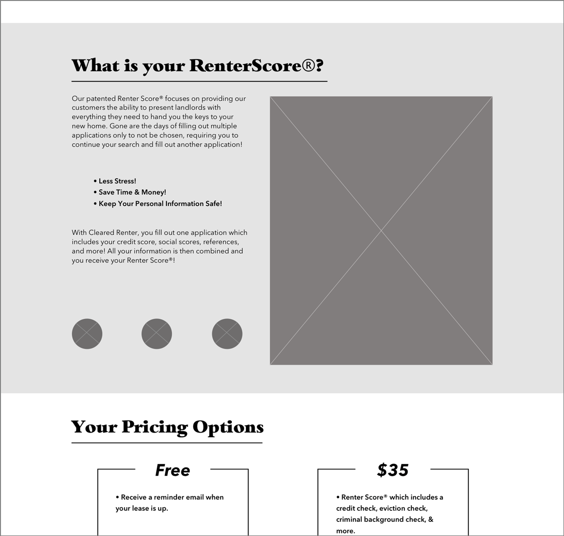
Cleared Renter is a simple tenant screening company looking to change the way the renting world works by saving renters and landlords time and money. Cleared Renter is a one-stop shop for applying for apartments, using a patented algorithm to receive a RenterScore® which helps landlords decide on renters faster.

The challenge

Cleared Renter reached out to our team to redesign a user-friendly desktop website in order to reach their business goal of 10,000 registrations within 12 months. They were aiming to launch their business with a redesign of their existing website, which wasn’t fully functional nor understandable.

The goal

•Redesign the website to provide a straightforward registration process that keeps the customer’s personal information secure and can provide a robust and detailed RenterScore®.
•Provide users with a clear understanding of how Cleared Renter can make their life easier in the apartment-hunting process.


The Process

Artboard - cleared renter.png


RESEARCH & dISCOVERY


•Heuristic Evaluation
•C&C Analysis
•User Interview
•Usability Testing
•Affinity Map


understanding the vision

We sat down with Cleared Renter’s stakeholder to understand the business goals. Our team learned that her largest priority was focusing on the renter’s flow through the website, including registering an account and applying for their RenterScore®, all while keeping the compassionate element of the company in the design.


sizing up the competition

To begin our research, we conducted a Heuristic Evaluation on the current website to pinpoint usability issues and note the severity.

Heuristic Evaluation


We also performed a Competitive and Comparative Analysis observing 7 competitor websites on common themes and features found in other tenant screening websites.

C&C Analysis

C&C Analysis


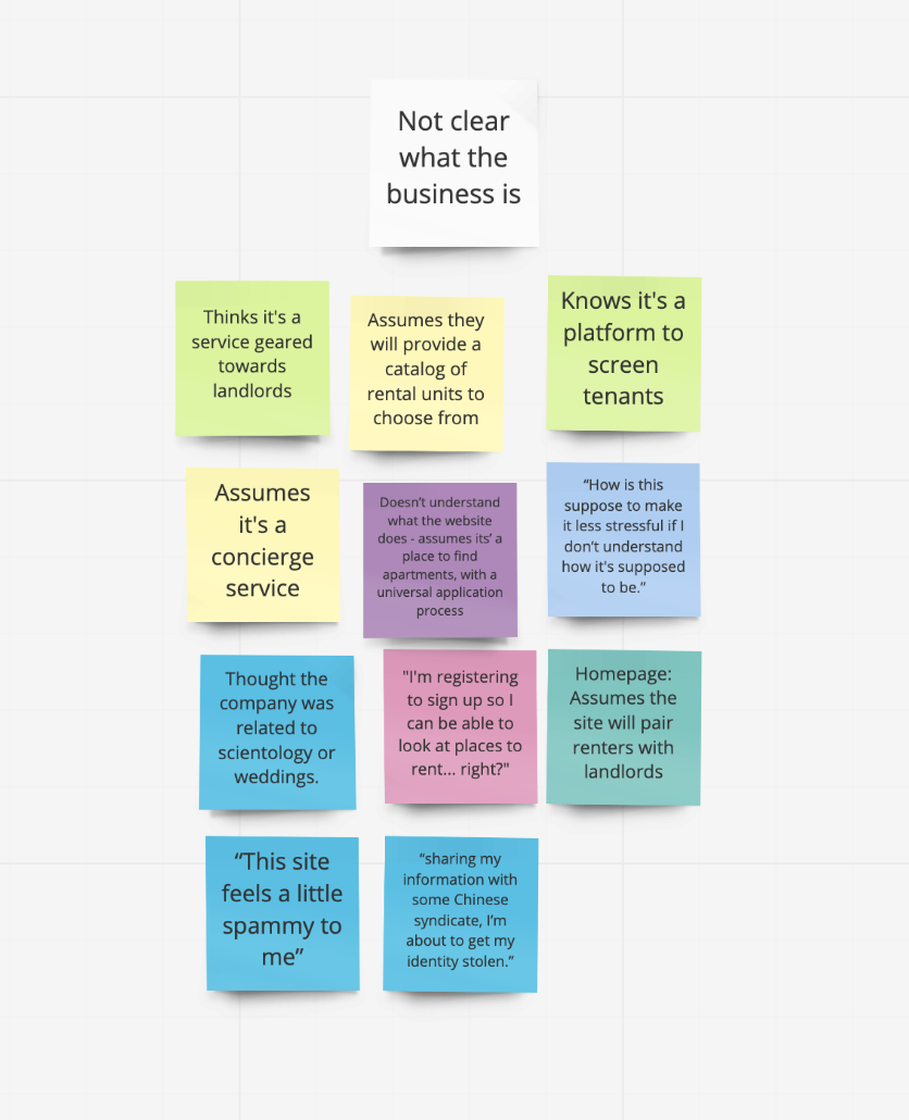
Main insights we pulled from our research thus far was that:


•The copy on the current website heavily focused on the humanitarian efforts of the owner instead of explaining the company

•The “About” page was dedicated entirely to a mascot that didn’t appear anywhere else on the website

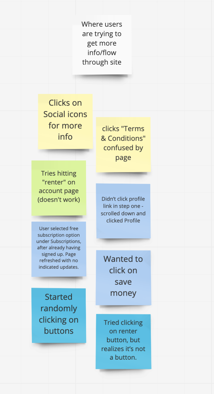
•After the account point in the flow, functionality of the website stops


Reaching out to our users

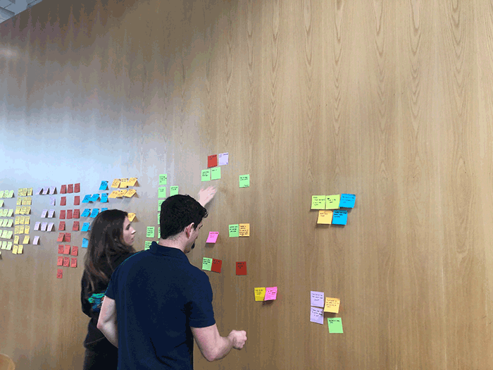
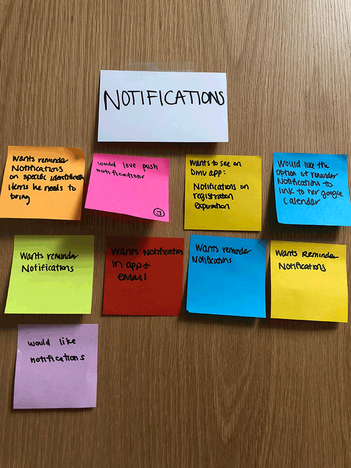
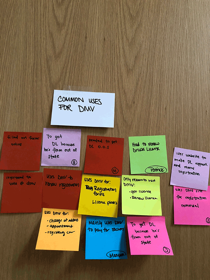
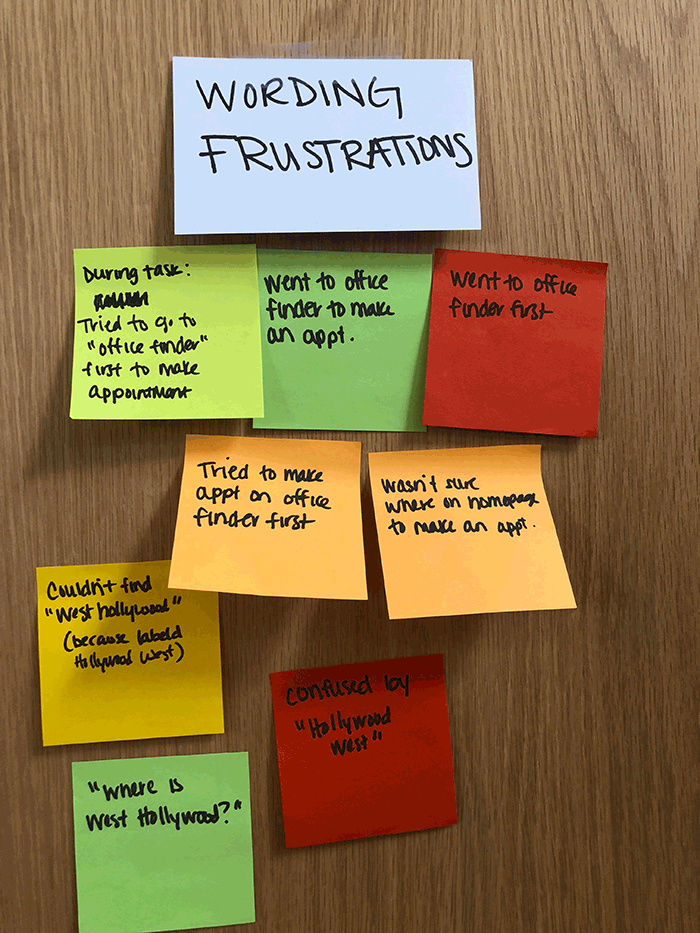
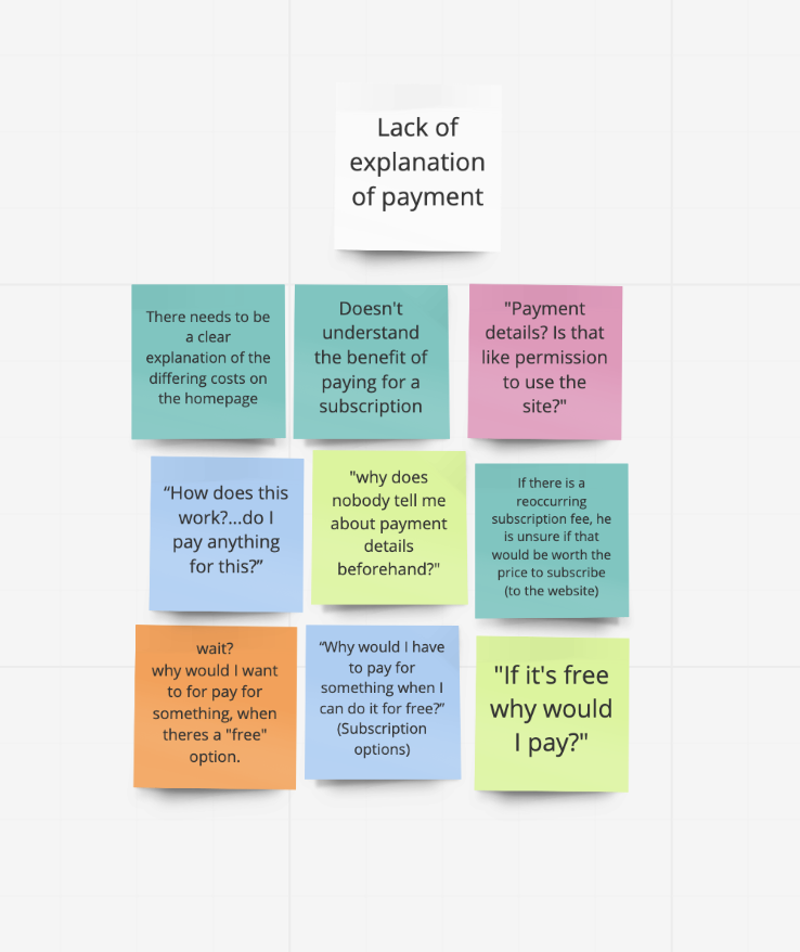
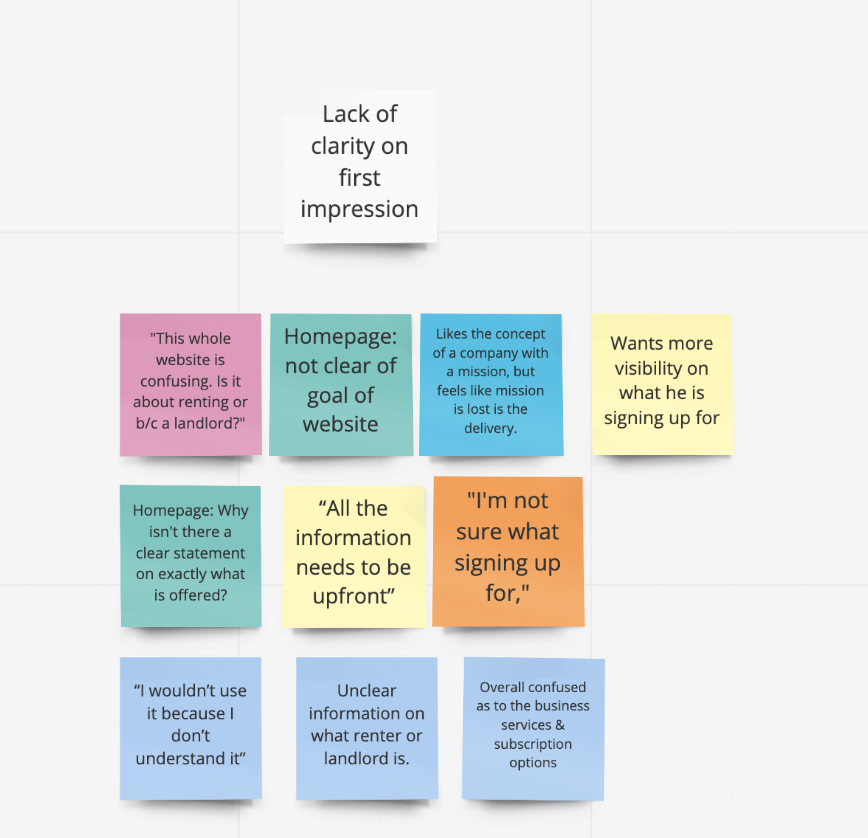
We wanted to hear other renters’ experiences with the rental application process, and what services are useful for them. Nine user interviews were conducted, along with usability tests where we asked them to go through the old website and vocalize their journey through the site.


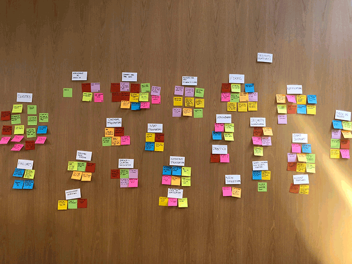
Understanding our users

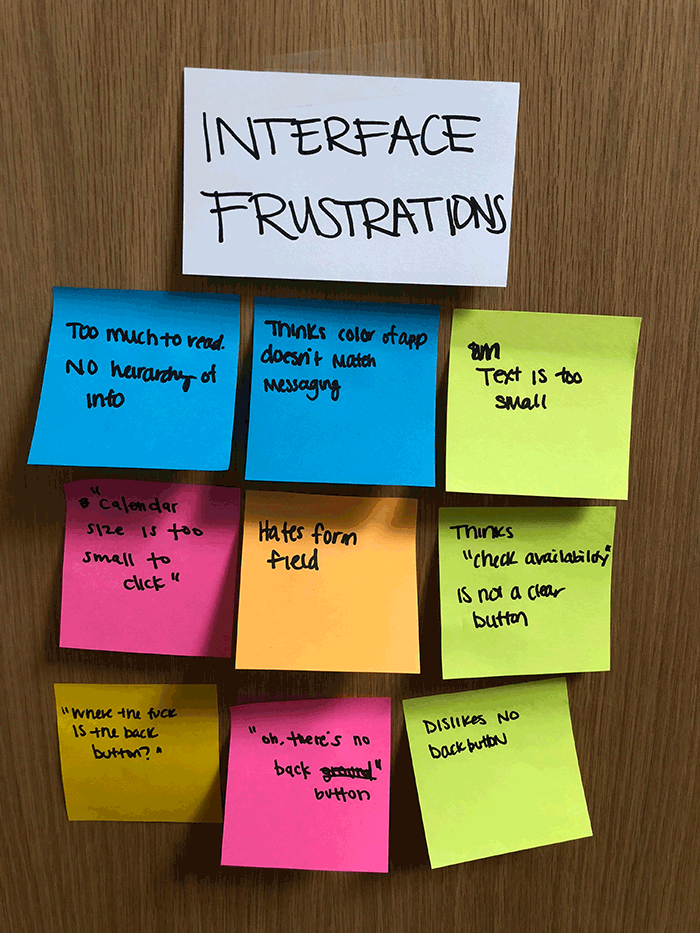
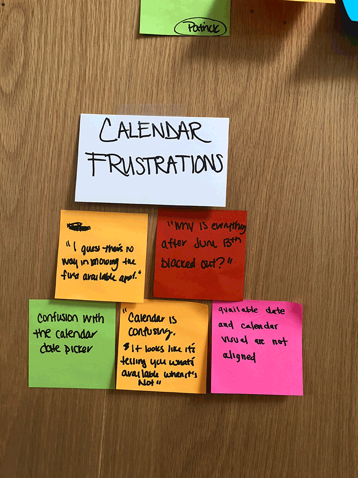
From our interviews, we identified 26 themes and concerns related to renting or the website. Through affinity mapping, we visually categorized them into groups and came up with 3 areas of focus:


  1. Flow of pages

  2. Lack of Information

  3. Visual Interface


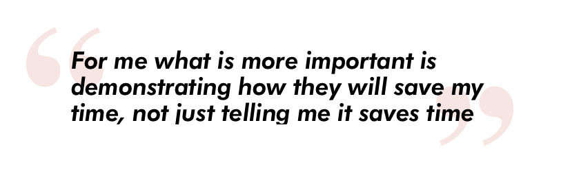
Our main take away was that users did not respond well to the mascot or the humanitarian efforts because they didn’t see a correlation to the business itself. Our users overall were confused about what services the business offered; they voiced that the website did not elicit trust due to its lack of visual professionality and they would not feel safe uploading sensitive information to.


DEFINING OUR RESEARCH


•Persona
•Journey Map
•Feature Prioritization

Synthesis

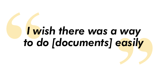
From here, we took our raw data and embodied that into a persona that represented our typical user. We documented our persona’s journey through the website, highlighting their pain points and emotions. Users who are in the application/moving process are often already frustrated, so we learned that efficiency of forms and clarity of the application process are crucial.


Click to Enlarge

Click to Enlarge


Scenario
Morgan just got a new position in Culver City. While she's packing her bags, making sure everything is good to go, Morgan is also multi-tasking and researching the renting market in Los Angeles.

Problem Statement
Morgan is moving and she already applied to 3 apartments but hasn't heard back from any of the landlords. Morgan has spent $200 on rental applications and is tired of seeing her money go down the drain.

How might we provide Morgan an intuitive and stress-free way to fill out one application to use for multiple rental listings?


prioritizing our findings

All of our research and synthesis led us to determine our key features for the redesign. In order to do this my team and I created a feature prioritization chart. We placed our features on a matrix, and rated them from essentials to non-essentials in order to prioritize build out the features and information that users require most. The essential features we focused on are:
•About
•Help
•FAQ
•RenterScore® forms

 
FeaturePrioritization.png


iDEATE & DESIGN


•Sketching
•Design Studio
•Wireframes
•Usability Testing
•Low to Medium Fidelity Prototype

Adjusting the flow

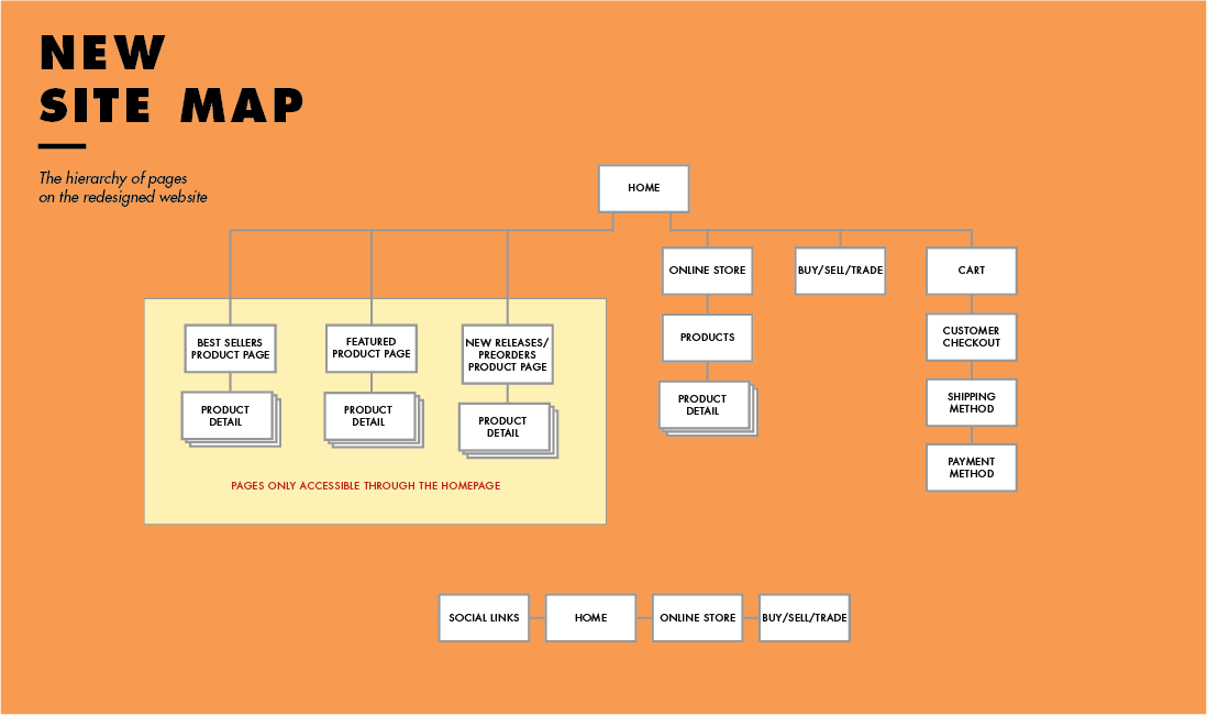
We then digitized our new user flow based on our feedback from the usability tests. The original user flow illustrates that the site stops functioning once you enter the account. A priority for our team was building out the functionality of the website, not only with working account features, but also implementing the the RenterScore® application form process within the account feature.


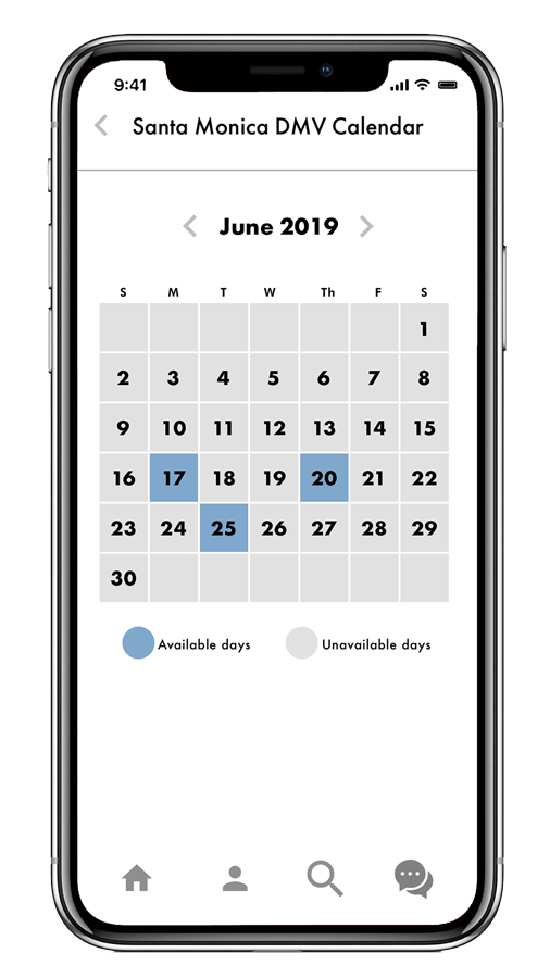
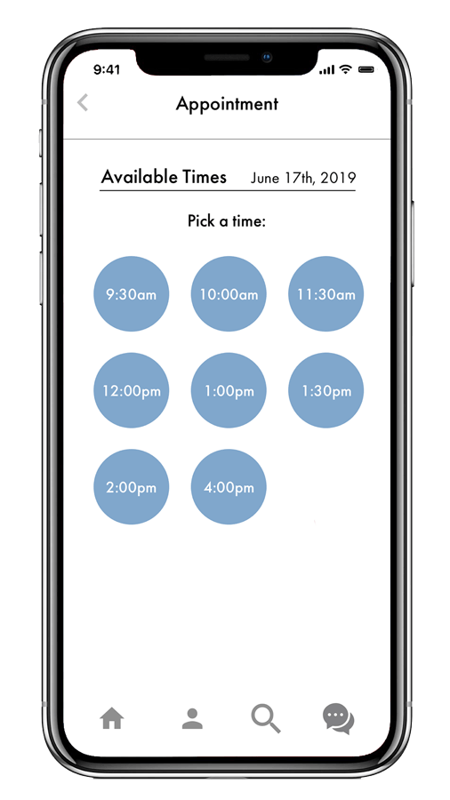
User flow of the old website - click to enlarge

User flow of the redesigned website - click to enlarge


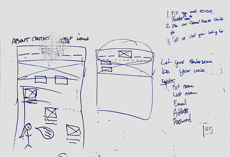
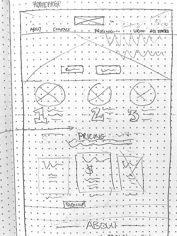
Sketching & low fidelity Wireframing

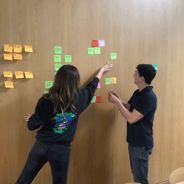
My team and I started on our design journey with a Design Studio, where we invited our stakeholder to join us for time-boxed sketching of each page of the new site based on our findings. We deliberated on the appropriate layouts, keeping in mind that clarity of the business and the process was a high priority.

We moved from whiteboarding to low fidelity sketches, to medium fidelity wireframes.


MEDium FIdelity prototype

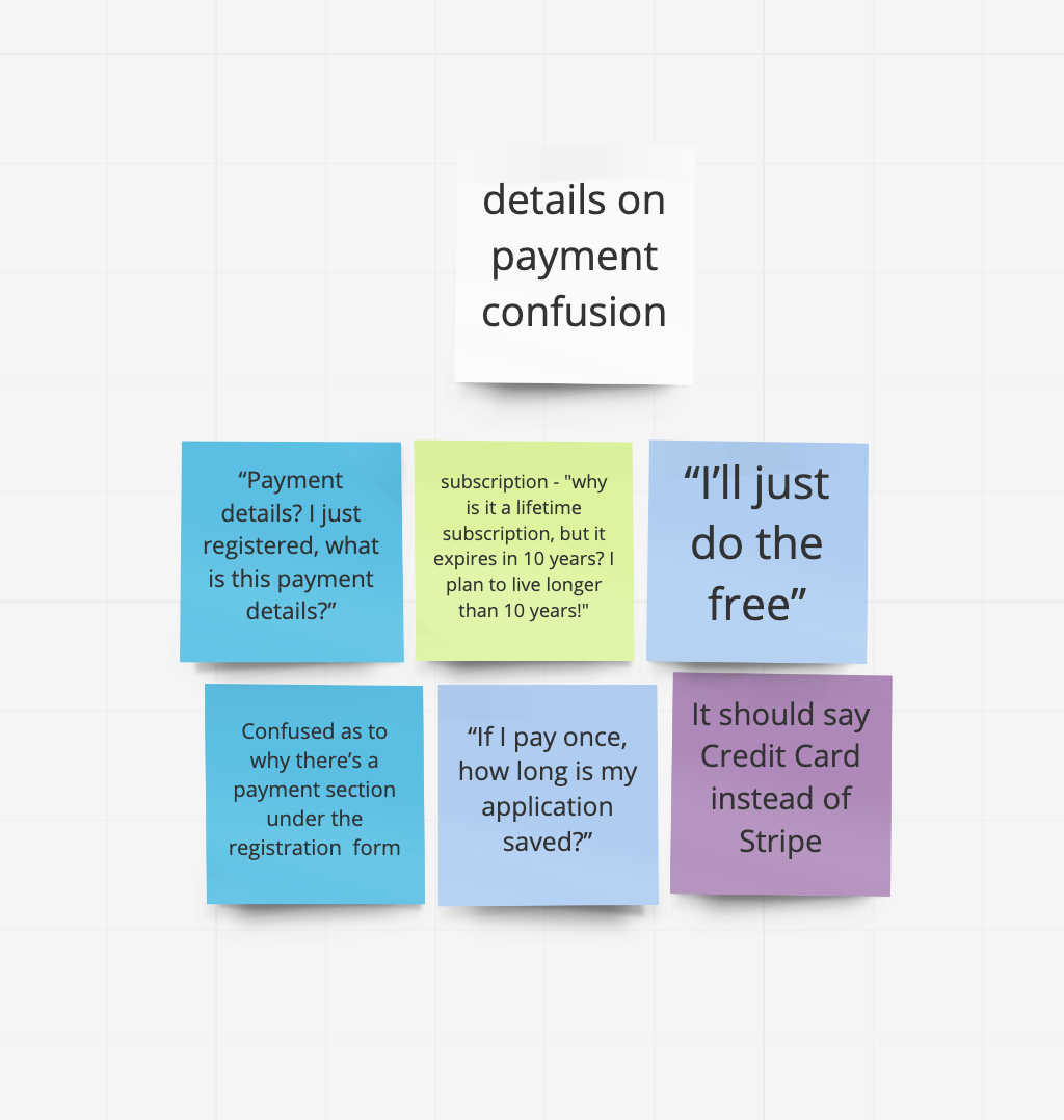
At this point, we conducted 4 usability tests on our grayscale clickable prototype in order to receive feedback on the flow and basic layout without users getting influenced or distracted by color and images.

A crucial part of the flow was how users navigated through numerous pages of forms. We decided to place them on a single page as collapsable sections.

Form pages - click to enlarge

This was easier for users to go back and change/adjust information if necessary. My team and I found it necessary to have a review/confirmation page displaying all information before submitting, so the user can be sure all information is correct.
We documented and made appropriate changes based on our usability test feedback while moving our designs into higher-fidelity wireframes.

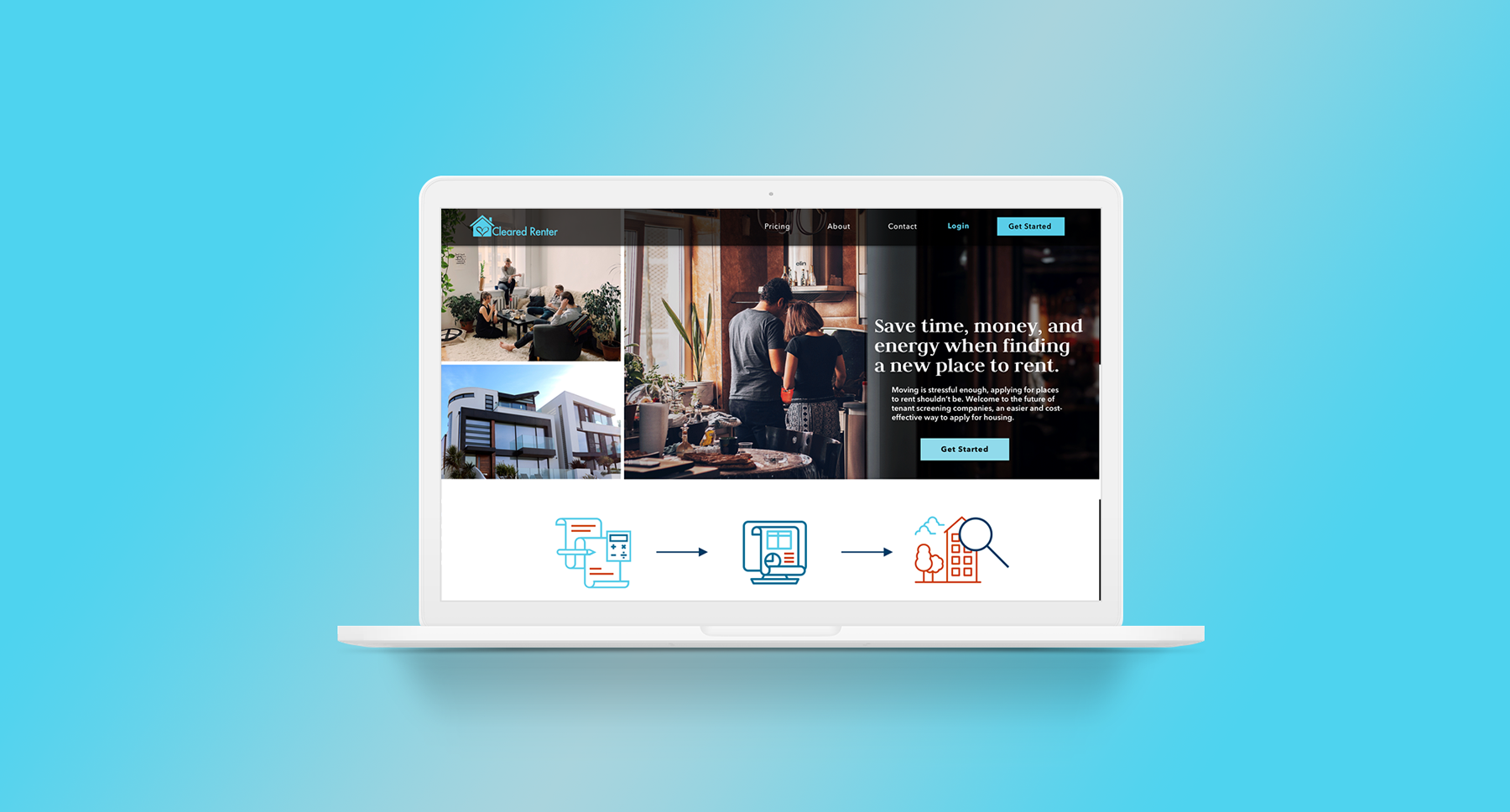
During our design studio we settled on having a long scrolling homepage that was also navigable by the top nav, so information was reachable from numerous paths.


cleared-renter-test-new.gif


Logo Redesign:

My team and I received feedback that the current logo did not represent the business accurately, and on the first impression, users said it looked like a logo for a dating website or wedding planning business. We all agreed that a redesign was necessary. I designed a new logo that was relevant to the business but keeping a nod to the old logo and company values.

logo redesign.png


Testing & Iteration


•Usability Testing
•High Fidelity Prototype
•Next Steps & Recommendations

High Fidelity Wireframes

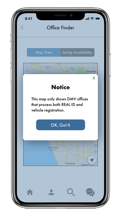
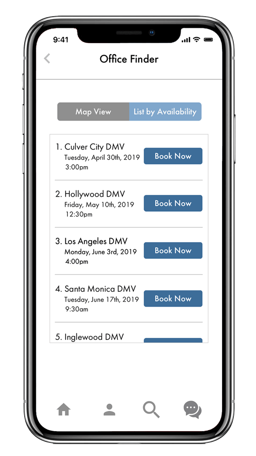
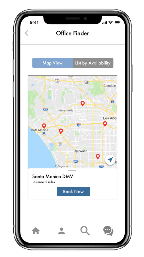
Our usability test results continued to confirm that we were on the right track with our overall design. We made changes to our CTA’s, and some of the verbiage used in order to ensure clarity for the users. We also added a map feature for our last form, all based on our usability test feedback.

Map feature on last form for users to visual the neighborhoods available

Map feature on last form for users to visual the neighborhoods available

This resulted in the design of our high-fidelity prototype that eliminated confusion and points of friction and allowed users to complete the application process.


final product

Here is a video which includes the entire user flow (Homepage, Account, RenterScore® Forms, Starting to Look Form) plus FAQ page and Landlord Account page.


next steps & recommendations


Based on our C&C Analysis

  • Ability to search for rental units directly on the site

  • Adding a Chat feature

  • Additional benefits to the Free Account subscription

Based off of user feedback

  • Update “About” copy [so it is more relevant to the business and services rendered]

  • Build out and implement landlord and property review feature

  • Reevaluate how to integrate the mascot into the website


IMG_5247.png
 
 
mockup.png
mockup_new-dmv.png

California DMV


Or view the video of final prototype found at the bottom of this case study


Platform iOS
Deliverables Research, Wireframes, & Prototype
Tools Sketch, InVision, Google Drive, Illustrator
Role UX Researcher, UX/UI Designer
Team Niki Sylvia, Warren Burstein, Karma Velasquez
Duration 2-Week Sprint

client overview

The California Department of Motor Vehicles services 40 million California residents and 27,000,000 licensed drivers as of 2017. The DMV’s mission statement is to be a recognized leader in public service, yet with a confusing app with limited functionality, they are failing to live up to this standard.  

The challenge

My team and I were tasked with re-evaluating the current mobile app and pitch an innovative and forward thinking redesign focusing on its most popular features.

The goal

Our team’s goal was to redesign and streamline the most popular feature of the app.


The Process

Artboard.png


RESEARCH & dISCOVERY


•Heuristic Evaluation
•C&C Analysis
•User Interview
•Usability Testing
•Task Analysis


Establishing a Hypothesis

Given our past experiences with the DMV, experience on their website, and observing the current app’s limited functionality, we assumed that scheduling an appointment would be our main focus. We began our research of the entire app, attempting to validate or invalidate this assumption.


Gaining insights

We began our research by conducting a Heuristic Evaluation of the current DMV app in order to pinpoint issues. The app has limited features and functions, but there were two glaring issues that violated a number of heuristics:

  • When attempting to make an appointment, choosing an office location before the desired service(s) would often lead to the app displaying locations that wouldn’t perform the service necessary, causing wasted time and frustration.

  • The app will display unavailable dates and times as available, which the user won’t realize until they have clicked through multiple pages to check availability. This causes the user to click the back button multiple times and re-do this flow every time to check for availability.

Heuristic Evaluation


My team and I performed a Competitive and Comparative Analysis of other states’ apps to see how California’s app performs in comparison to other states’ and what features are common and useful. Here we observed that adding the ability to create an account and add a GPS location finder would be useful additions to fixing the appointment flow.

C&C Analysis


Interviewing users

Finally, we conducted user research to understand our audience and advise our design. We spoke to California drivers who had been to the DMV recently or frequently and learned most people use the DMV website for scheduling appointments.
In conjunction with our user interviews, we performed a task analysis with our users in an attempt to validate our assessment of the aforementioned issues with the appointment scheduling flow. Our task was as follows:

You live near Hollywood and need to schedule an appointment with the DMV for a (1) driver’s license renewal and (2) vehicle registration.


Revisiting our assumptions

Our original assumption was validated based on our heuristic evaluation and task analysis as users experience frustration with:  

  1. Finding a location that processes both services

  2. Selecting an available date and time.


Illustrating current flow

We designed a user flow of the current app so the points of frustration are visually apparent. We noted where users experience friction with the current system (the location-service loop users would get stuck in, shown in red), leading to wasted time and some users even abandoning the app altogether.


Click to enlarge


DEFINING OUR RESEARCH


•Affinity Map
•Persona
•Journey Map
•Feature Prioritization

Synthesis

In order to synthesize and understand our research, we created an affinity map. We then grouped similar items to reveal insights and themes. Main takeaways included:

  1. Users couldn’t find where to make an appointment

  2. Users often didn’t know what items were going to be necessary to bring to their DMV appointment and wanted some sort of reminder

  3. Users reacted negatively to choosing a location and then discovering numerous steps later that the service isn’t offered there


Compiling data

After compiling all of our user research, we embodied that into a Persona to create a profile of our audience.


We then documented our persona’s emotional journey through the appointment flow with a  journey map. This is based on our user’s journey’s during the task analysis, and averaging the points of frustration they experienced.


Scenario
Carson will be buying a used car from a friend and will need to transfer the title and register it with the DMV. Because of the new law requiring California residents to get a REAL ID by October 2020, he decides he’s going to handle the title transfer, registration, and ID at the same time. However, Carson is a busy accountant and won’t visit a DMV office without an appointment.

Problem Statement
Carson is trying to schedule an appointment but feels confused about selecting the right office location and finding an available date and time, causing him to grow frustrated and impatient.

How might we provide Carson with an intuitive and efficient way to schedule an appointment?


prioritizing our findings

With a better understanding of our users, my team and I prioritized the features of the new app. Because of the limited duration of our project, we had to hone in on specific features for a Minimum Viable Product (MVP). The blue dots on the graph below indicate those specified features:

Click to Englarge


iDEATE & DESIGN


•New User Flow
•Sketching
•Design Studio
•Wireframes
•Usability Testing
•Low to Medium Fidelity Prototype

redesigning the flow

After deliberation, we decided that the most crucial point of frustration to tackle first was reworking the location-service loop that users got trapped in during their appointment scheduling flow. To resolve this, we designed for the user to select their service first, which would update the possible locations displayed, therefore only showing accurate results.


User flow of the redesigned website - click to enlarge


Sketching & wireframes

We began ideating our designs with a collaborative design studio (click images to enlarge).

We moved onto medium and high-fidelity wireframes rather quickly, focusing our design on our determined feature prioritization. Main redesign points we focused on were:

  • Calendar to only show available dates and times.

  • Visual map and a list view of locations (to assist users and ensure that they can find the closest office to them based on their service needed)


Here are high-fidelity wireframes of the location and calendar portion of the app:


Testing & Iteration


•Usability Testing
•High Fidelity Prototype
•Next Steps & Recommendations

Testing our prototype

We conducted seven usability tests to observe how users reacted to our current prototype. During this process we made huge discoveries that led us to have to redesign a large feature of the app.

Here is a portion of the old design, where we had the user create an account at in the beginning of their appointment making flow.

Here is a portion of the old design, where we had the user create an account at in the beginning of their appointment making flow.


Originally, we included account creation screens at the beginning of the appointment scheduling flow so users could benefit from saved information within their account. This feature allows users to fill out their forms digitally before their appointment and submit the forms electronically before they arrive at the DMV, thus saving time for the user during their in-person experience.  


Important discoveries


We discovered through usability testing that users did not like being interrupted in their appointment scheduling flow with an account creation, so we had to rethink and redesign where we placed the account creation information. To account for this problem, we created tutorial screens instead, which render upon opening the app and explain the value of creating an account.

Here is the new design based off of usability testing, where we removed account creation from the flow, but instead created tutorial screens which explain the benefits of account creation so the user can do it on their own time.

Here is the new design based off of usability testing, where we removed account creation from the flow, but instead created tutorial screens which explain the benefits of account creation so the user can do it on their own time.


Final product


next steps

A common theme was discovered during our research: users would prefer to avoid dealing with the DMV altogether. To address this, we considered ways to replace physical DMV interactions to the app, so users wouldn’t have to go to the DMV as frequently and could manage everything through their account in the app. However, because of the limited duration and scope of our project, we had to focus on the MVP. In the future, we will revisit our research and design to include the following features and service design improvements:


Features

  • Account Dashboard - where users can manage their profiles, personal information, forms, etc.

  • Fingerprint Scans and Face ID (“Security Authentication Features”) - enabling the ability to process certain DMV aspects through the app instead of in-person

Service Design

  • Live Chat/Chat Bot - users can have basic questions answered or assistance finding forms

  • Check-in screen from a mobile device upon arrival at the DMV.


dmv-mockup.png
Mockup-copy.png

going underground records


Or view the video of final prototype found at the bottom of this case study


Platform Desktop
Deliverables Research, Wireframes, & Prototype
Tools Sketch, InVision, Photoshop, Illustrator, & Google Drive
Role UX Researcher, UX/UI Designer
Team Niki Sylvia
Duration 2-Week Sprint

client overview

Going Underground Records is central California’s largest and longest running vinyl store. They buy, sell, and trade records, and are known for their eclectic and rare collection.

The problem

Going Underground Records’ e-commerce website has a convoluted faceted navigation process, information architecture that is difficult to follow, and the imagery and user interface does not match the vibe of the products and physical store.

The goal

Redesign the website to improve navigation and browsing capabilities to provide a straightforward checkout process.


The Process

Artboard - going underground records.png


RESEARCH & dISCOVERY


•Heuristic Evaluation
•C&C Analysis
•User Interview
•Task Analysis
•Affinity Map


Analyzing & Comparing

I began the research with a heuristic evaluation on the current website noting 21 violations and their severity. The critical ones being in areas of error management, learnability, and efficiency.


I then performed a competitive & comparative analysis, comparing features of competitor websites with Going Underground Records in order to display specifically where it was lacking. Here is a breakdown of the competitors:


The biggest points of concern that I learned from the C&C was that Going Underground Records would not allow the user to filter by multiple categories at the same time, nor did it display carousels of popular categories.

UX presentation_1-04.png


User perspective and pain points

In order to gain perspective on who the targeted user was, I conducted 3 user interviews with avid record collectors, who buy both online and in-store. All concluded that the biggest points of interest when buying records are:


  • New vs. used

  • Condition of the record itself

  • Condition of the art

  • Year of release

  • Label that released it

  • Track listing

  • “Recommended listening based on your search”


After user interviews I conducted a task analysis on 3 users, asking them to “Go through the website and shop in both list and grid mode, for 3 different albums, purchasing multiples of each one.” The following are direct user quotes:


Emerging Themes

I synthesized the data from the interviews and task analysis through an affinity map, where the following themes emerged:

 
  • Users were confused whether they were buying new or used records [the front page of the website defines that the store sells used records, but nowhere mentions if each item is new or used)

  • Users want multiple photos of the front and back of the album art and photos of the record itself

  • Users prefer for the website to list album information: track listing, label, and year of release, otherwise, they will look it up elsewhere and may purchase from a different website

  • The navigation in “list” mode was completely jumbled and unusable, mixing artists, labels, years, and merchandise in one long list


DEFINING OUR RESEARCH


•Persona
•Journey Map
•Feature Prioritization
•New Competitive & Comparative Analysis
•Card Sorts
•Site Map
•User Flow

Synthesizing the journey

I combined all of my research thus far into a persona, Dakota. Dakota wants an efficient way to browse online for her favorite records while getting all the supplementary information she needs to feel solid about her purchase.
I tracked Dakota’s journey through the current website with a journey map. This map illustrates her main frustrations with the lack of advanced browsing capabilities, confusing navigation, and the inability to purchase more than one album.


Click to Enlarge

Click to Enlarge


Discovering Insights

In addition to the emotional journey map through the site, I created a user flow of the checkout process steps. By doing this I was able to uncover that the major frustrations felt by users was not due to the flow of the checkout process. The frustrating features for users was the navigation and browsing.


Click to enlarge


Pinning down the focal point

Because of this discovery, I focused on filtering, browsing and navigation capabilities within the shopping portion of the website. I conducted another Competitive and Comparative Analysis this time not just on features, but instead on what filtering options competitors used. I also compared what different collection carousels were listed on the competitors homepages which users said would help narrow down their searches.

 
UX presentation2-07.png
 

I took all the different possibilities based on this C&C and conducted card sorts with 5 users to further understand how users categorize information. The trends from the cards sorts were:


• Newsletter shouldn’t be in the global navigation
Featured, New Releases, and Best Sellers are the most popular collection categories
Genre and format are the top browsing categories
Alphabetical, price, release date, best selling, and featured and the most popular sort by options

 
UX presentation2-06.png
 
card sort.jpg
 

Priorities of the redesign

At this point, I am able to map out the priority features for the redesigned website:


UX presentation_1-08.png


iDEATE & DESIGN


•Sketching
•Paper Prototype
•Medium-Fidelity Wireframes
•Mood board

Information Architecture

Now that I had broken down how to reorganized the information architecture based off of user research, I designed a site map based on my findings (as well as the old site map for comparison). The goal was to remove pages that didn’t hold information (location, newsletter, and contact) and incorporate that information either on the homepage or the footer.


Sketches

Now that I designed the updated site map, I began the redesign process by sketching out a paper prototype to visualize how the new site map would affect the user flow. I tested this paper prototype to ensure that a user could intuitively find all of the information needed, as well as easily filter and find their desired record.


MEDium FIdelity prototype

I moved from sketches to a medium-fidelity prototype, the biggest change being moving merchandise out of the faceted navigation with the vinyl, and instead in its own section which can be located through a drop-down menu on the homepage.


Defining the mood

Before moving on to high-fidelity wireframes, a mood board was designed. Users said during interviews that the lack of visual professionalism of the website affected the users’ desire and trust of the company, so a branding redesign was necessary.

UX presentation-12.png


Testing & Iteration


•Usability Testing
•High Fidelity Prototype
•Final Deliverable

Testing the prototype

As I continued designing a high fidelity prototype, I also organized usability testing. I asked 3 users to go through the website and buy a punk + LP record that was $10 or under. Based on user feedback I made small design adjustments to the interface.

This resulted in the design of a medium to high-fidelity prototype that eliminated confusion and points of friction and allowed users to complete the application process.


final product


Mockup2.png